As I’m finishing up with tweaks and additions to Farmhand, it’s time to face the other big chore that goes under my Publisher’s Hat (for this book, a ten-gallon stetson I think). I’m putting a cover together. Designing a cover for any genre takes many things and rolls them all up into one 4500×2800 pixel package. I need to cue the specific sub-genre (Western Romance, sweet, modern), and I need to align loosely with the popular books in that sub-genre. I’m seeing photographs, which is great, although I would also consider an oil-painting effect as long as it wasn’t too loose (think L’Amour covers). The fonts are more fancy, even girly, which makes me happy.
I chose title fonts that remind me of the L’Amour covers I referenced above, and for the author’s name, a really nice swirly handwriting font. Below you’ll find several versions, more than I would normally make, but these will go into my portfolio, as well, if anyone is looking for a cover designer who can branch out into new genres at the drop of a hat. That’s a big hat.
Which one do you prefer? Which one makes you want to look inside?

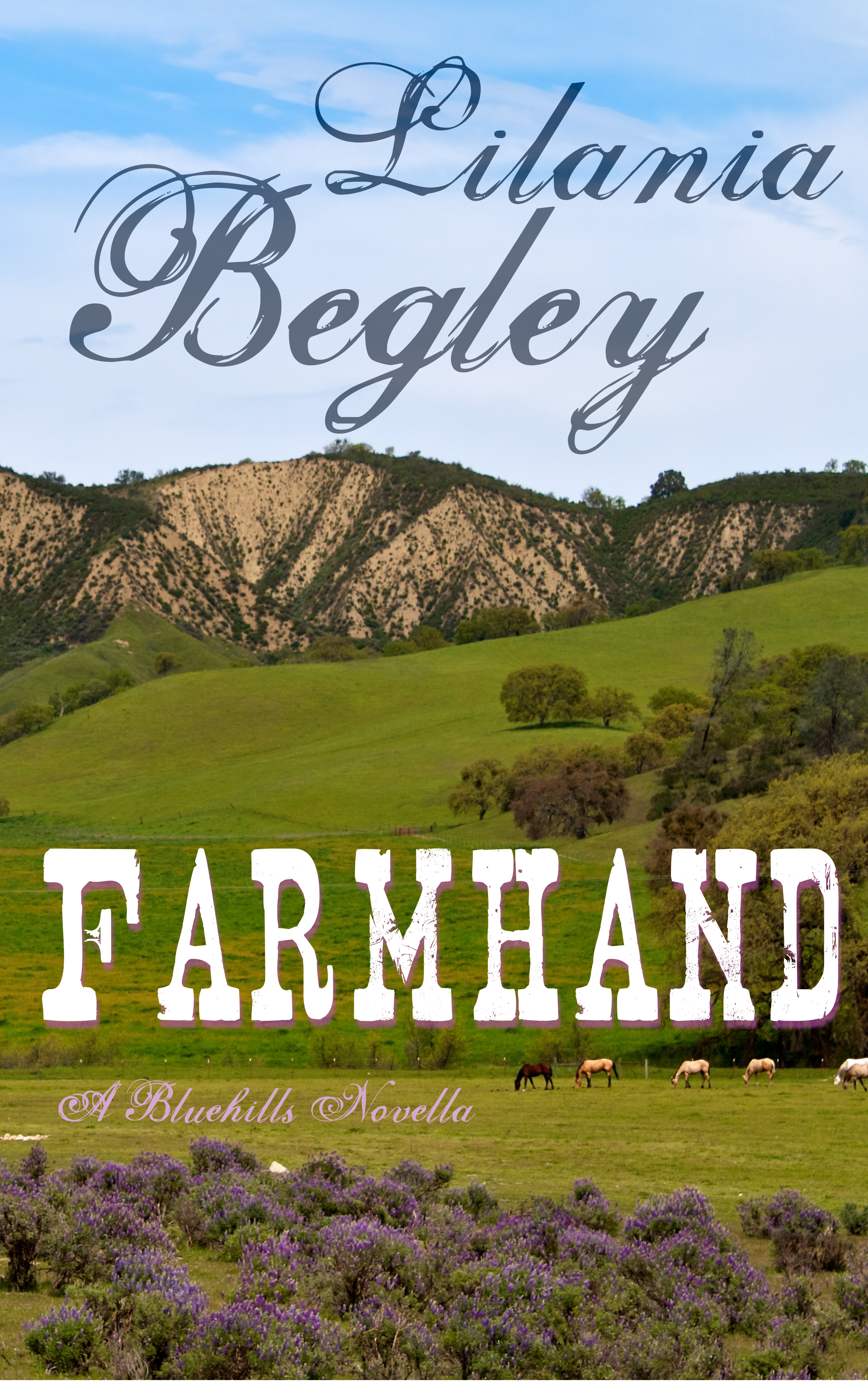


Well, the first one makes me think “Decapitated horse”, which probably isn’t what you’re going for. LOL.
And unless the gal is the farmhand, from the title I somehow expect to see a hunky guy on the cover (preferably with his shirt on, though I might be alone in that).
But the stock photos are lovely, and I do like the fonts you’ve chosen (all of them, but especially the one for your name). 😀
LikeLiked by 1 person
LOL! Yeah, I was working with freebie stock photos (I might buy stock for this cover, but not to demo on the blog) and the horse came that way.
And yes, in this case the girl *is* the farmhand.
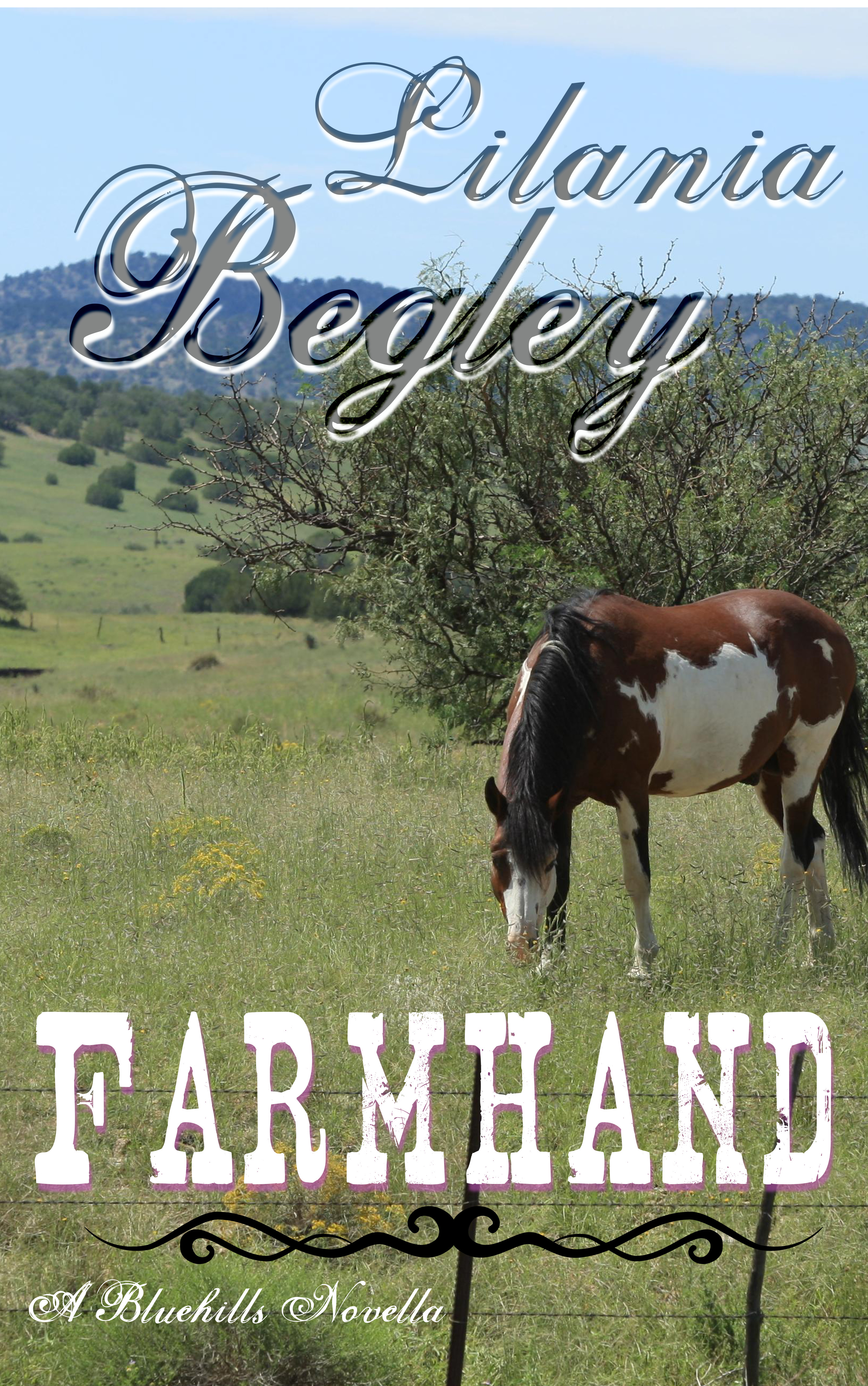
I’m inclined toward the one with the paint horse grazing, myself.
LikeLiked by 1 person
Where’s the shirtless guy, and the swooning woman in a skimpy nightgown half fallen off? 🙂
This isn’t a genre I often read, so I won’t weigh in on the benefits of the various covers. (And the guy who doesn’t always drink beer? Why would anyone assume he knows anything about it, then?)
But from purely a graphic design perspective, the first cover isn’t right: the picture is cut off oddly (I’m guessing the original had something distracting in the parts you’re not showing?), the layout is not well balanced, and the color scheme is grey and drab compared to the others—practically black-and-white compared to the garish colors of dime romances I see in the library. Photoshop can cure these, of course, perhaps by stealing the background from the grazing horse picture. (What I can’t say is whether it would be worth the trouble, whether the genre is better signaled with a human being on the cover or not.)
Regarding the last cover, the decorations seem to invoke American Indian influences—I don’t know whether these are authentic or they merely feel that way, and I’m not sure that matters much. At any rate, I’d only include them if one of the main characters’ Amerindian heritage was a theme in the book.
BTW, the title font you’re using in most of the examples needs kerning around the capital A; the font in the last one just needs a bit between the F and the A. On second thought, the first three need kerning between the F & A, and a bit of spacing between the rest of the letters to match the feel of the HAN spacing. (http://xkcd.com/1015/ is relevant.)
LikeLike
Yes, they both do that with the kerning… and I’m working with GIMP, so likely i can’t tighten on just one letter. What I could do would be to move that first letter to a different layer and tighten it manually.
For this particular genre, I do not have to have a person on the cover. In fact, a shirtless male usually signals explicit sex in a modern romance, and this one doesn’t have that, so I’m signaling appropriately for the sub-genre and story.
The divider is from an 1890’s copy of Colliers, but I see what you mean about the vaguely tribal look.
LikeLike
IN GIMP, II tend to kern by making every letter it’s own object and lining it up accordingly. If you want to finish it up in Inkscape (play with it when you aren’t on a deadline) that is likely possible to adjust individual letters. Another thing you can try is to highlight two letters and adjust the kerning with the highlight– but that may be the ghost of Photoshop talking.
If you are no longer doing graphical stuff and JUST want to make layout decisions, I strongly recommend Scribus. It is a professional desktop publishing suite that was released to open source. The people who support it are mostly folks who worked for the company back in the day. There IS a learning curve, so now is likely not the time to get into it. But basic stuff is pretty easy, if you have time to read the demos. I try to put together a flier or similar from time to time just to get used to the different paradigm. I know for a fact that kerning and font handling is thoroughly professional. Even Adobe can’t touch Scribus with some of it– and I don’t say that lightly.
Also the final render is less…idiosyncratic. You can be SURE everything is lined up correctly. It also does color separation and gives great results for printed material. It also handles much higher resolutions. AFAIK professional publishers still use it.
LikeLike
I will definitely look at Scribus, but you’re right, it can’t be now. Heck, I have the full power of Adobe Creative Cloud at my fingertips, and I’m not using Photoshop because I don’t have time to make it work for me like I can with Gimp, since I’m already familar.
I’m going to be putting up a couple of fresh cover designs shortly… And yes, a girl riding would be ideal. Finding the stock for that has so far been fruitless. I need a blonde female rider, with no dorky-looking helmet (I know, I know, helmets are for safety. But they look dumb for this).
Yes, this has already gone out to betas, but I am working on an updated version, I’ll add you to that list. Thanks 😀
LikeLike
have you searched Devientart for stock photos yet?
LikeLike
I don’t use DA for stock because I’ll go cruising along, fall in love with a picture… and not be able to get rights. Or not be able to contact the creator, or… and I’m very picky about making sure my cover art is properly licensed.
LikeLike
Center the horse and rider on the first one, and you’ve got your cover, Ced
LikeLike
Sadly, that is the photo, it’s cut off. I was using it as an exemplar, if I’d chosen that one, I would have found a different photo with a whole horse in it. I’m leaning toward one of the landscape shots, as that’s what the other books in this sub-genre seem to have. I just need to make it softer and more glowy.
LikeLike
Cedar, I would go with a cover similar to the first one, but choose a female rider who is dressed more appropriately for ranch work, perhaps a smaller figure looking out over a landscape? The ‘just landscape’ pictures don’t tell me much about the story; the girl on a horse tells me a little more. (Lots of subject material out here for cover pictures for that genre, if you come visit sometime! 🙂 )
LikeLike
About the covers: Overall, I think the last cover is the most successful. I do like the paint, but I keep thinking how cool it would look centered.
‘m excited to see what freeholder has up to offer, but I suppose that depends on how much time you have. I agree with her that a female rider dressed to work would communicate the best!
Did you send out beta copies yet? OR do I need to scrape my spam folder again?
LikeLike
The last is the best in my opinion, although the shadowed “farmhand” doesn’t work for me, as it looks blurred rather than shadowed. The first one would annoy me as the mc isn’t a brunette. The middle two keep making me think that the name of the book is Lilana Bagley. So, definitely the last. Though I like the picture for the Pinto one the best. Good luck! Great story.
LikeLike
Being difficult here – I’d go for the middle picture, myself, but it doesn’t say romance at all. Apparently faces are what we look at first. I’ve had some success with pasting pictures in backgrounds, but it is hard.
LikeLike
there’s a new picture, with a rider, on the other post, did you see it yet?
LikeLike
Sorry, no I hadn’t yet. Get a rider (i.e. not me. I’m the original Benito with my talent for dismounts) to give their opinion of posture etc. It’s one of the ‘danger areas’ for authors – horses, guns and to a lesser extent boats (Ok probably fashion too, in certain circles. But I am so expert at that and make-up, that no one dares question MY discernment;-)).
LikeLike
Oh – Have I mentioned I spent a large part of my girlhood in the saddle? Lessons and everything 😉 I write fondly about cowboys because I’ve known some.
Fashion and make-up I’ll leave to you. I know my limitations. Paint… I can do paint. Make-up not so much.
LikeLike
of the choices presented I like the first
LikeLike