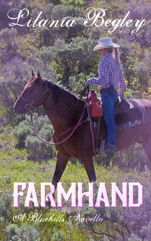
UPDATED: I have bowed to peer pressure (kidding, kidding!)The cover chosen by popular acclaim is now:
OK, based on feedback and sorry, everyone, finding a picture of a blonde woman riding a horse that is affordable stock doesn’t seem to be happening, so… These are the final two options. Because I have class (and that’s not what I mean! LOL)


I’d say the first one.
LikeLike
Top. Having the center essentially empty (as with the bottom) makes no sense from a composition, if you’re going to have the livestock off in the distance. It looks like there was space left for an image in the middle–and lost or forgotten.
LikeLike
I should probably clarify that there will likely be a small text blurb on the finished cover, but I won’t have it until a week or so from now, when this is in final production. But yes, I do like the Paint horse.
LikeLike
Ooh! The first one!
LikeLike
Mixed feelings. The first works better than the second, but neither seem to me fit the title. Neither show IMO a scene from a working farm or somebody working on a farm.
Of course, YMMV applies. [Smile]
LikeLike
I’m trying to appeal to Romance readers. Working farm images are… Well, *I* like them! but a bit grittier than the average light-and-fluffy-book reader wants.
LikeLike
Top one
LikeLike
Of these two, the first one, but … Ranch Hand, perhaps? Anyway, I was wondering if you might be able to find a picture of a rider some ways off, maybe just a silhouette of the horse and rider?
LikeLiked by 1 person
Top one, with the horse. (And you do so have class — in both senses of that word.)
LikeLiked by 1 person
First cover with the horse!!
LikeLike
I like the photo and fonts in the top one, but the layout in the bottom one better.
Between the two as they are, the top one is my vote. 🙂
LikeLike
Go with the paint horse.
LikeLike
Second one.
LikeLike
Top one.
LikeLike
In the “chosen by popular acclaim” version, could you try splitting your name over two lines, and putting them left-aligned near the upper-left of the cover? I like it overall, but right now it feels like there’s a distracting void beneath the name “Lilania”. (Actually, this version is OK; the void was more noticeable in the pink-highlighted version on Facebook.)
LikeLike
There will be a blurb there in time.
LikeLike
Is there enough room for a blurb? Put in a blurb with some Lorem ipsum text, and I think you’ll need to pan the image a bit to avoid overcrowding.
LikeLike
I think that the first one is better but I’m wondering why her knee is extended like that.
LikeLike