I have permission from the talented Gina Marie Wylie to use one of her covers to illustrate a before-and-after of an ebook cover, taking it from amateur, to professional, in a few easy steps. I am using Gimp 2.8 on a Mac, Gimp is freeware, and the last upgrade makes it almost as powerful for design as InDesign or Photoshop.
Gimp does have a learning curve if you are coming into it cold, but there are plenty of video and text tutorials available. Putting some time into laying out a cover can really pay off big, because no matter what they tell you, people really do judge a book by the cover.
I am a professional cover artist and designer, and I wanted Gina’s cover to match the quality of the story inside. Her original cover looked like this…

- I think she was using a Createspace template

Very dull, not at all professional, and it clearly needed help. I asked her to send me just the art, and started with opening the art as a layer on top of a template I use for covers in Gimp (I use a 6″x9″, 300 dpi size, so it is print ready as well). The art I scaled up and slid around until I liked what I saw, then I anchored it to the background layer, as you see below.

- The art, scaled to a suitable ebook cover size and shape.

Now, we can begin to lay out text on this. Author’s name can go on the top or bottom, it’s up to you. Once you pick one, remember that you will be keeping it, for an overall branded look to your covers.
Author’s Name and Title, on a Science Fiction book, should be very large. This holds doubly true for an ebook, where most shoppers get their first impressions from a thumbnail size.

- Here we are with just the large text elements added

Because I wanted to have some text elements smaller than others, I started out with the large elements, choosing complementary fonts that were suitable to a SF book. Scrollwork, script fonts, or anything that could be called ‘flowery’ is not a good choice for SF, but might be perfect for Fantasy. And never use a font you would use inside the book (i.e. Times New Roman, Courier, Arial).
I also chose to add a filter, called lens flare, to the title, because I like to give a little life and motion to the text rather than leave it flat. I will be adding another filter, drop shadow, to the author’s name.
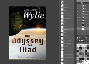
- With all the text elements added

And here is the final step, adding the smaller text elements and aligning them with the larger ones. I have also added the series identifier, very important to help your readers out with which book goes where in a long series like this one.
Already, you can see that this looks much better, and all we did was use text on art, which she purchased through a stock art retailer.
Finally, the finished results, below.

- Final look for a great SF effect!

You can do this yourself. Get Gimp, make sure your artwork is purchased or copyright free, and go to town. Study books in your genre to see if you are cueing properly to your readers, every genre has specific quirks.
I highly recommend Dean Wesley Smith’s cover design workshop if you have many books you are needing to work on, and want to invest in InDesign skills. I know from experience you can go through the workshop without using InDesign, but I am competent in both programs, so I’m not sure how well it would work for a beginner.
Trust me on this, you will see sales pick up if you put the effort into producing professional covers for your books. If you cannot do it, or feel you don’t have time, seek out an independent designer who can walk you through the process or create them for you. You can contact me for design or consulting at this address.
Happy designing!
If you’re curious about the story, you can find it at Amazon by clicking the cover icon below.


Oh good! I’m glad to see that the art itself wasn’t a problem. Because I saw the “before picture” and thought, “Well, it’s great art, but poorly presented! Too much beige!”.
The crop really makes it pop!
To be fair, I have seen professional efforts like the before picture. They were textbooks from 10-ish years ago. Usually the kind for boring subjects. Really not the association you want to build for your book– especially with that title.
LikeLike
Yes, the art was fine, and this wasn’t about art, Sarah covered that recently.
But you really don’t want to signal non-fiction on a novel cover, especially not when it looked like a Gutenberg book redone for kindle.
LikeLike
LOL, no. I never meant to imply that I thought the cover was fine as it was!
LikeLike
This was tremendously helpful. What a huge difference your changes made!
LikeLike